02 · Certezia · DIGITAL-HUMANS
Physical complexity is part of UX too.
I redesigned a DNIe and NFC digital signature flow by separating what users needed to understand from what they physically had to do. The new journey reduced the number of steps by 40% and achieved an 8/10 NPS in user testing.
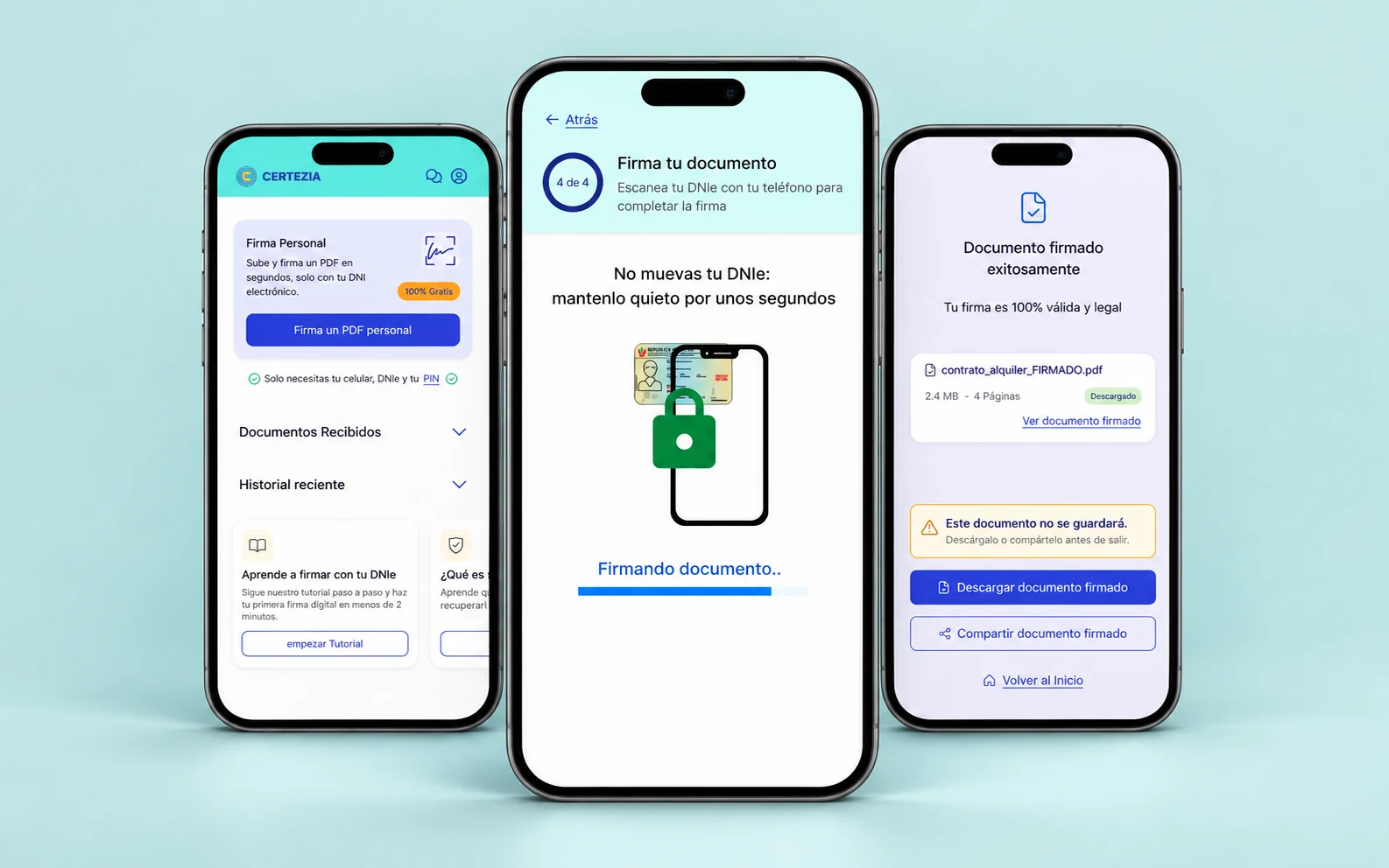
Physical complexity is part of UX too.
The problem
The system asked for data at the worst moment: while the user held the ID against the phone. The NFC signal dropped and the error explained nothing.
My role
End-to-end Product Designer: market, archetypes, scope, flow, prototype, validation and UI Kit.
Outcome
−40% steps in the critical flow and 8/10 NPS in a usability test.
01
Context and opportunity
Signing digitally with an electronic ID card looked straightforward on paper, but in practice it required several things at once. Users had to understand the instructions, enter or remember their PIN, use NFC, position the DNIe correctly against the phone and respond to what was happening on screen.
This meant the challenge was not purely digital. Part of the experience happened in the interface, while another part happened physically between the user, the phone and the ID card.
The signature did not happen only on screen.
Users had to understand the process while physically handling their DNIe and phone.
The opportunity was to separate those two types of effort.
Instead of explaining everything at once, the experience could guide one decision or action at a time.
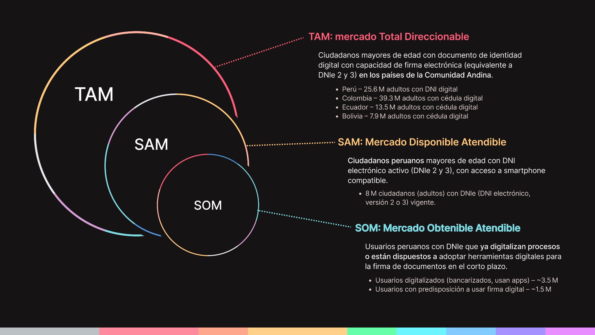
TAM / SAM / SOM: market segmentation for Certezia.
02
Two users, one app
I defined two archetypes with opposite needs: the citizen signer (the digital student, the overloaded professional), who doesn’t know their eID can already sign and fears “doing something wrong”; and the professional generator (the freelance case manager), who needs to send documents and know who signed. I built a Business Model Canvas for each: freemium for citizens, B2B subscription for generators.
With that I prioritised Release 1 using MoSCoW: eID signing, clear confirmation and download were Must; the signing simulator and support chatbot were pushed back.
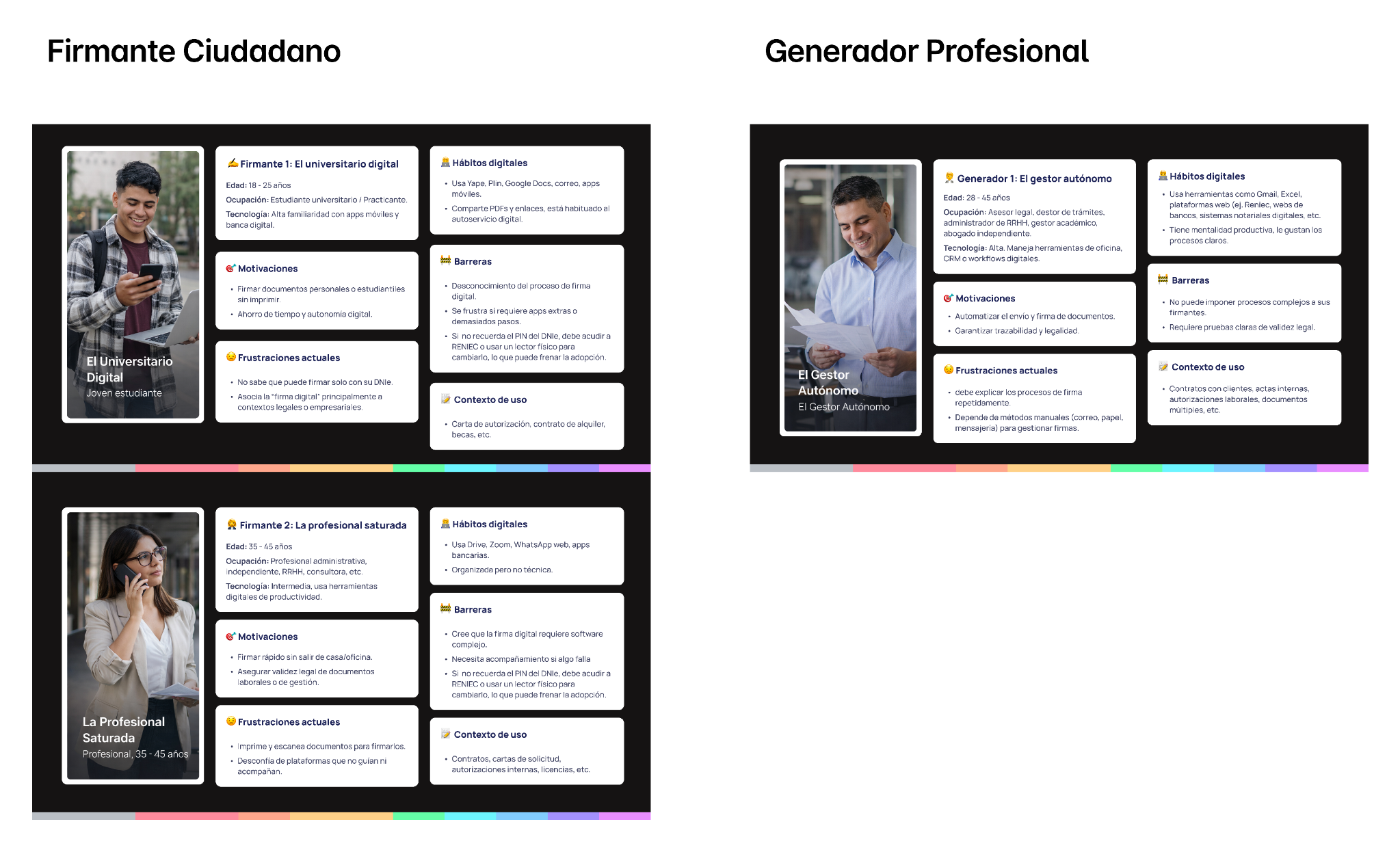
Signer and professional generator archetypes.
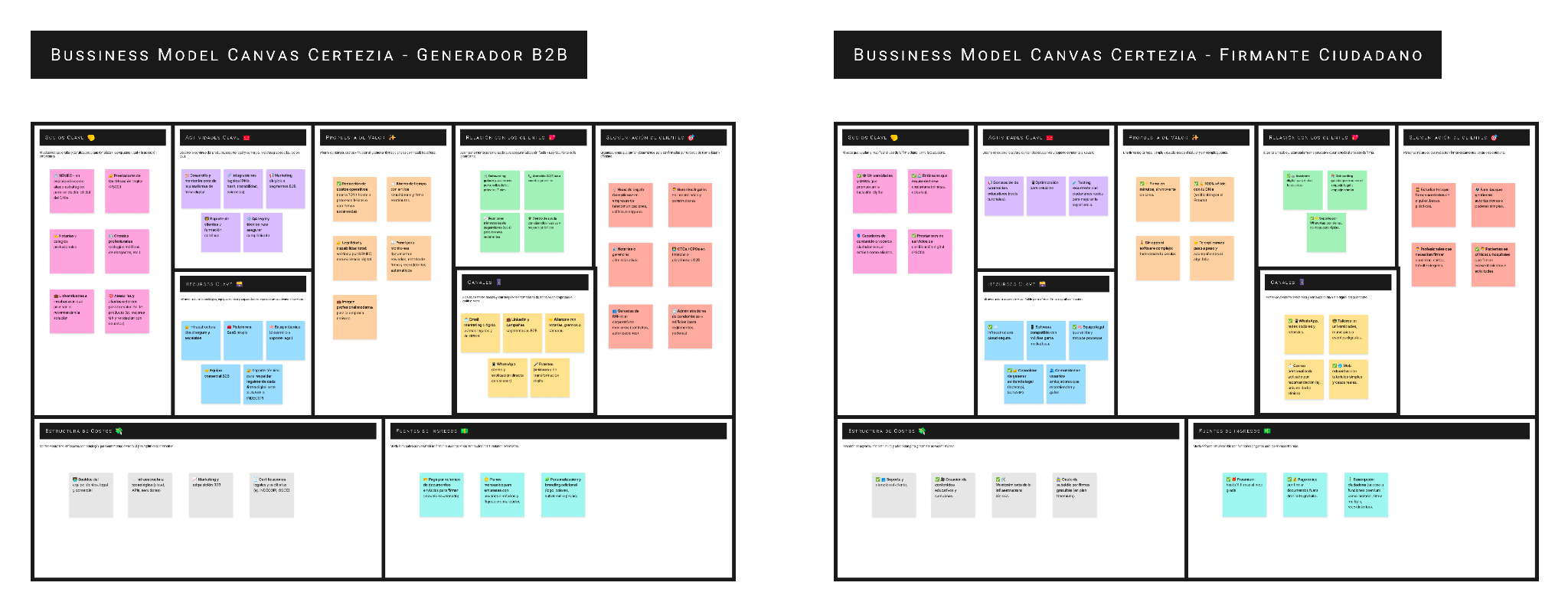
Business Model Canvas: B2B generator and citizen signer.
03
The challenge
The challenge was not simply to remove screens. I needed to understand what required the user’s attention at each moment and which physical actions could compete for that attention.
If someone was trying to find the correct NFC position, that was not the right moment to ask them to interpret a long block of instructions. If they were deciding which document to sign, they should not need to think about positioning their DNIe yet.
The problem was not that users needed more explanation.
I needed to stop asking them to do too many things at once.
Each screen needed to answer one simple question:
What do I need to do now?
04
The problem
When I reviewed the original flow, I found moments where instructions, decisions, system states and physical actions were all competing for the user’s attention.
This became especially difficult when something went wrong. If NFC reading failed, the PIN was incorrect or there was an issue with the ID card, it was not always clear what had happened or how to continue.
- Too many simultaneous tasks
Some screens required users to process information while performing a physical action at the same time. - Limited clarity during NFC reading
Users needed to understand what was happening while keeping the DNIe positioned against the phone. - Difficult error recovery
PIN, NFC and document issues needed to explain both what had happened and what to do next. - Technical dependencies
The experience was constrained by the actual capabilities of the device, NFC and SDK.
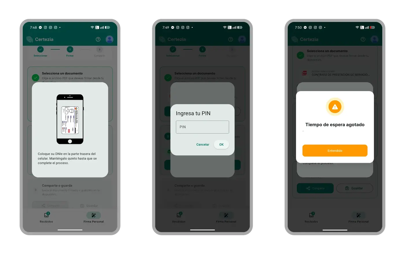
Three screens from the original flow: confusing NFC guide, PIN during scanning and generic error.
05
Technical constraints
This was not a project where I could design first and ask later whether something was technically possible. NFC behavior, the DNIe and the SDK directly shaped the experience.
I worked with development to understand which states the system could detect, what information it could expose and which situations depended on the device or the ID card itself. Those constraints became part of the design from the beginning.
- The SDK can detect whether the document is eID 2 or 3, which opens the door to removing manual selection.
- The CAN can’t be requested after scanning on iOS (native reading covers it), so it’s asked before.
- The 5-attempt PIN limit is enforced by the ID chip, not the app: the design informs without promising control.
- Scanning can be cancelled but not paused: I ruled out help that depended on pausing the read.
A good instruction could not promise something the system was unable to detect. Key interaction decisions were checked against the real capabilities of the SDK.
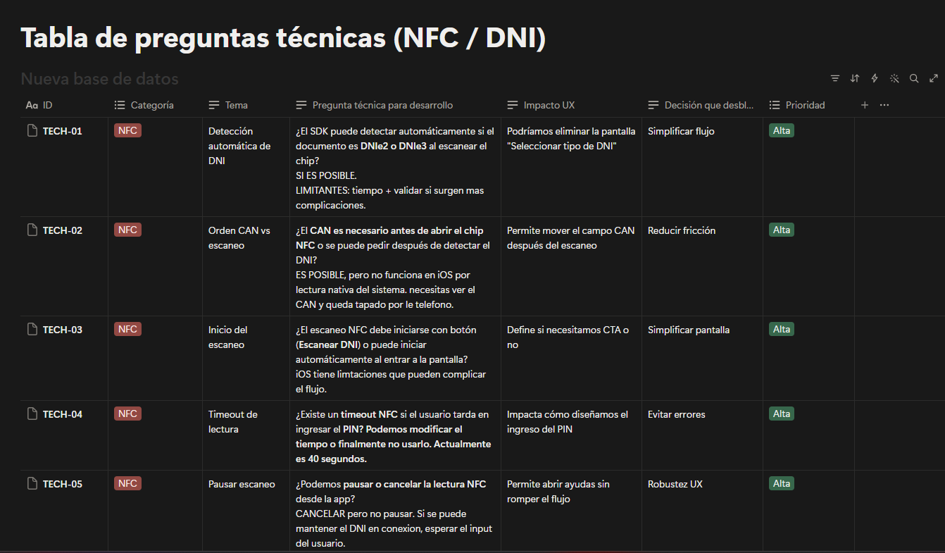
NFC / ID technical questions and their impact on UX decisions.
06
Design decisions
01Separate decisions from physical actions
Users first needed to understand what they were about to do. Interaction with the DNIe and NFC came once that decision was already clear.
02One primary action at a time
I reduced simultaneous decisions so each screen had one clear purpose.
03Break the journey into stages
I organized the flow around three clear moments: Document, Identity and Signature.
04Make system status visible
During processes such as NFC reading, users needed to know that the system was working and what they should do while waiting.
05Design recovery, not only success
PIN, NFC and document errors were treated as part of the journey. I designed how to explain what had happened and how users could continue.
06Design within real technical capabilities
Interaction decisions were reviewed with development to make sure they could be implemented with the available SDK.
07
Mapping the flow
Before moving into visual detail, I mapped the complete journey, including the main path, intermediate states and potential errors.
The goal was for Document, Identity and Signature to work as understandable stages on their own while still feeling like one continuous process.
Mapping error states alongside the happy path allowed recovery to be designed from the beginning instead of added later.
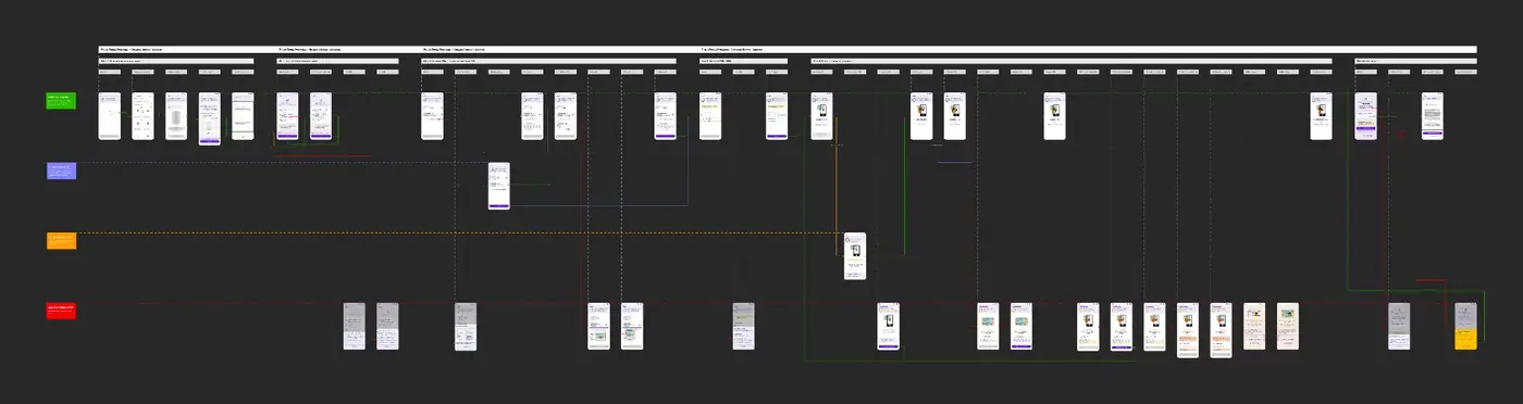
State and error map
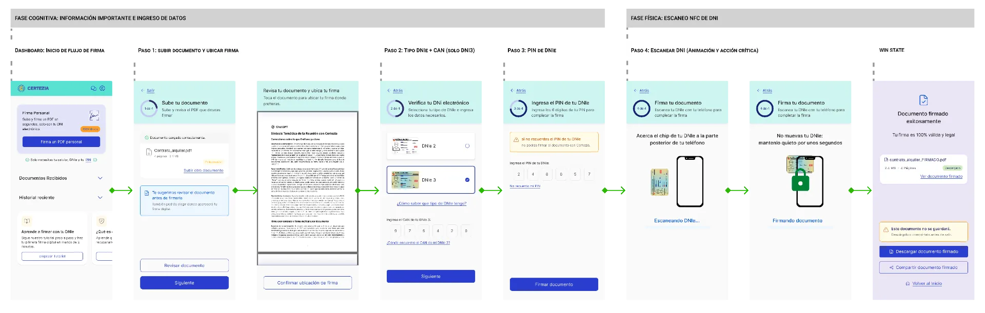
Complete signing flow
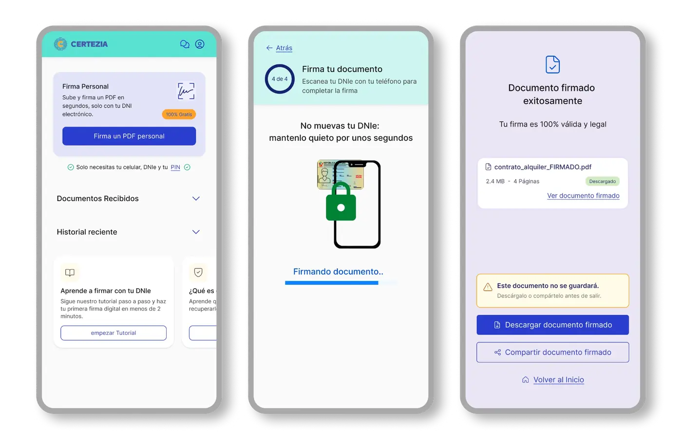
Final journey proposal
08
Voice and tone
In this flow, content was part of the interaction itself. Instructions needed to remain understandable while someone was holding their phone, positioning the DNIe or trying to recover from an error.
I prioritized short messages, direct verbs and one main instruction at a time. I avoided explaining the technology when what users really needed was to know what to do next.
The question behind every instruction was simple: can I understand what to do while I have my phone and DNIe in my hands?
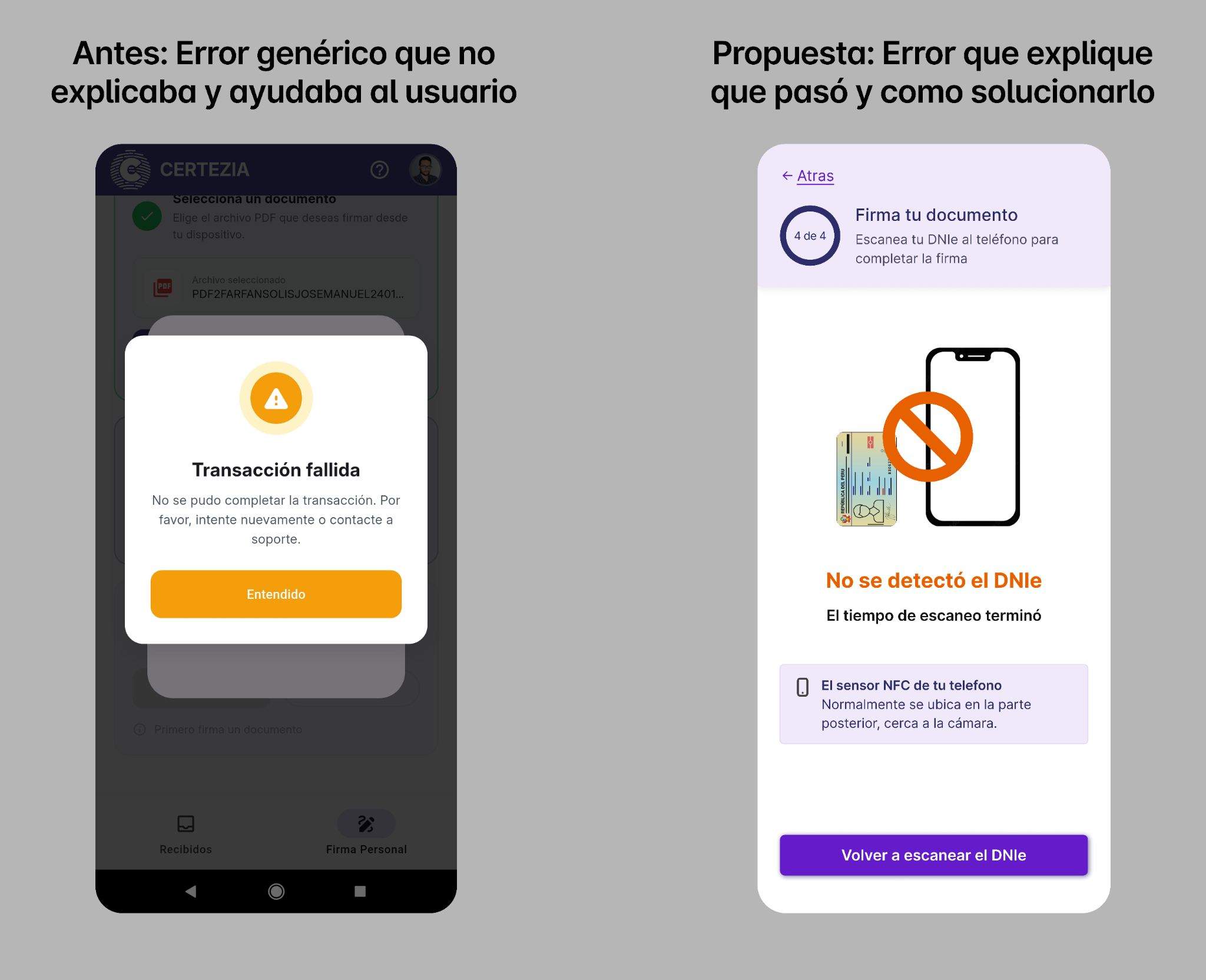
Before and proposed design: from a generic error to actionable guidance.
09
Validation
I tested the flow with users to observe something an interview alone could not reveal: what people understood and what they physically did with the phone and DNIe at the same time.
Testing exposed hesitation around instructions, waiting states and error recovery. I used those sessions to refine copy, hierarchy and interaction behavior before finalizing the proposal.
The resulting experience achieved an 8/10 NPS in user testing.
Test result: 8/10 NPS.
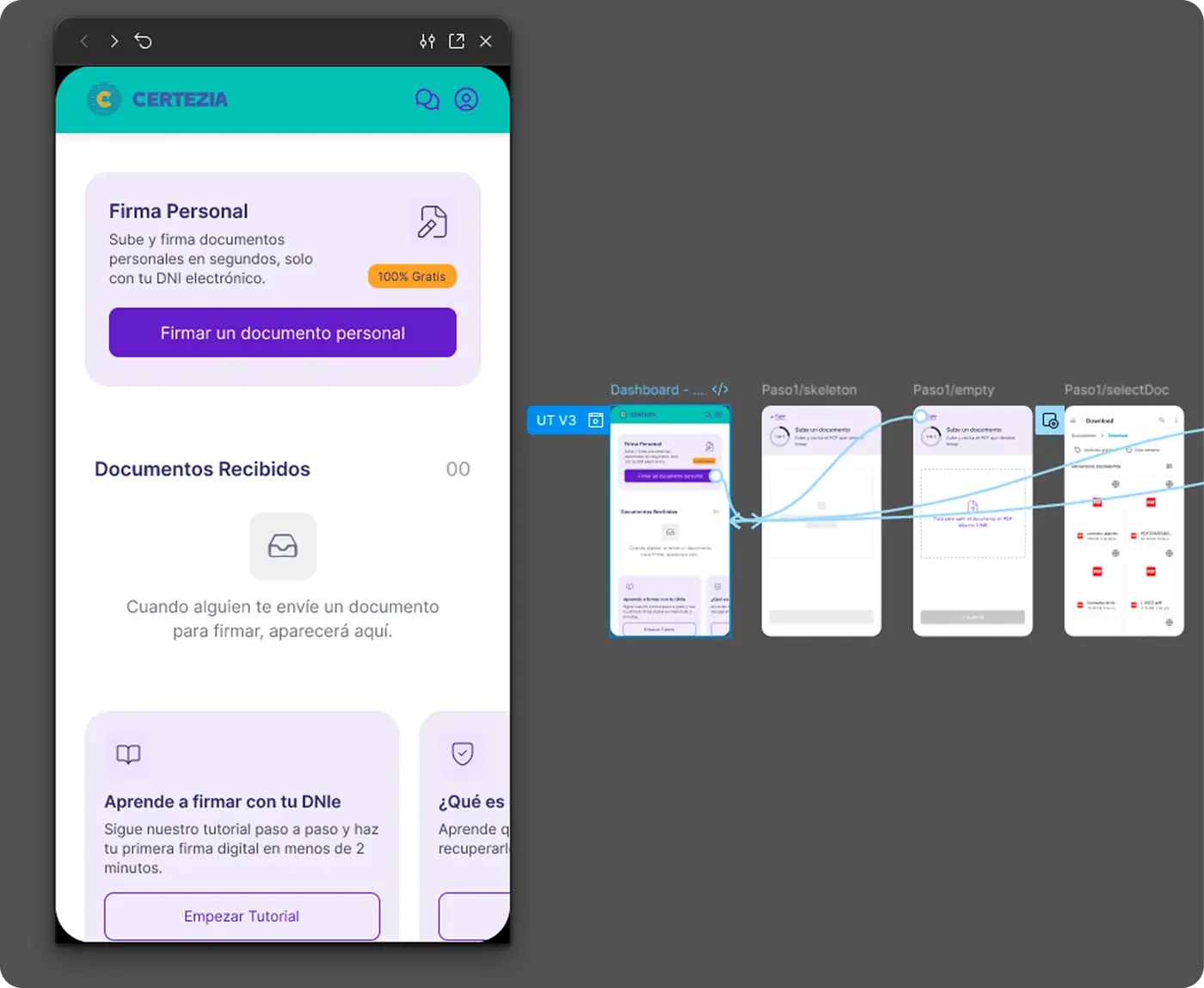
Interactive prototype in Figma.
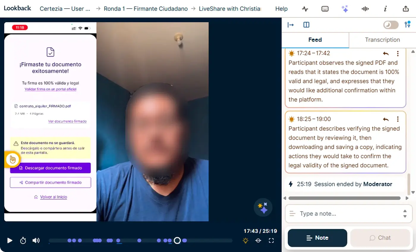
Usability test session in Lookback.
10
What we learned
Testing confirmed that simplifying the experience was not only about reducing screens. It was also about choosing when to ask for attention, when to ask for a physical action and when to let the system do its work.
What worked
- Breaking the process into clear stagesDocument, Identity and Signature helped users anticipate what was happening.
- Providing context right before an actionInstructions worked better when they appeared at the moment they were needed.
- Designing error recoveryUnderstanding what had happened and how to continue reduced the feeling of being stuck.
What I adjusted
- Instructions that were too longSome messages could be simplified further during physical interactions.
- Waiting statesI needed to make it clearer when the system was still working.
- Contextual helpSupport needed to appear close to the point where the question occurred, not earlier.
The most important improvement was not a screen. It was separating what users needed to think about from what they needed to do with their hands.
11
AI in the process
I use AI to speed up, not to decide. This is what I did with it and what I kept deciding myself.
I used AI for
- Claude: moderation guide (structure, questions, metrics), Lookback setup, technical report draft and synthesis of interview feedback.
- Lookback (Eureka AI): goals to surface themes across sessions.
- Lovable: UI Kit from a prompt built on the visual system I extracted from the reference PDFs.
What I decided myself
- Which questions stay in the guide and which go.
- Which copy version ships and every flow decision (tap-to-place, data order).
- The hierarchy of components, colours and states I gave Lovable.
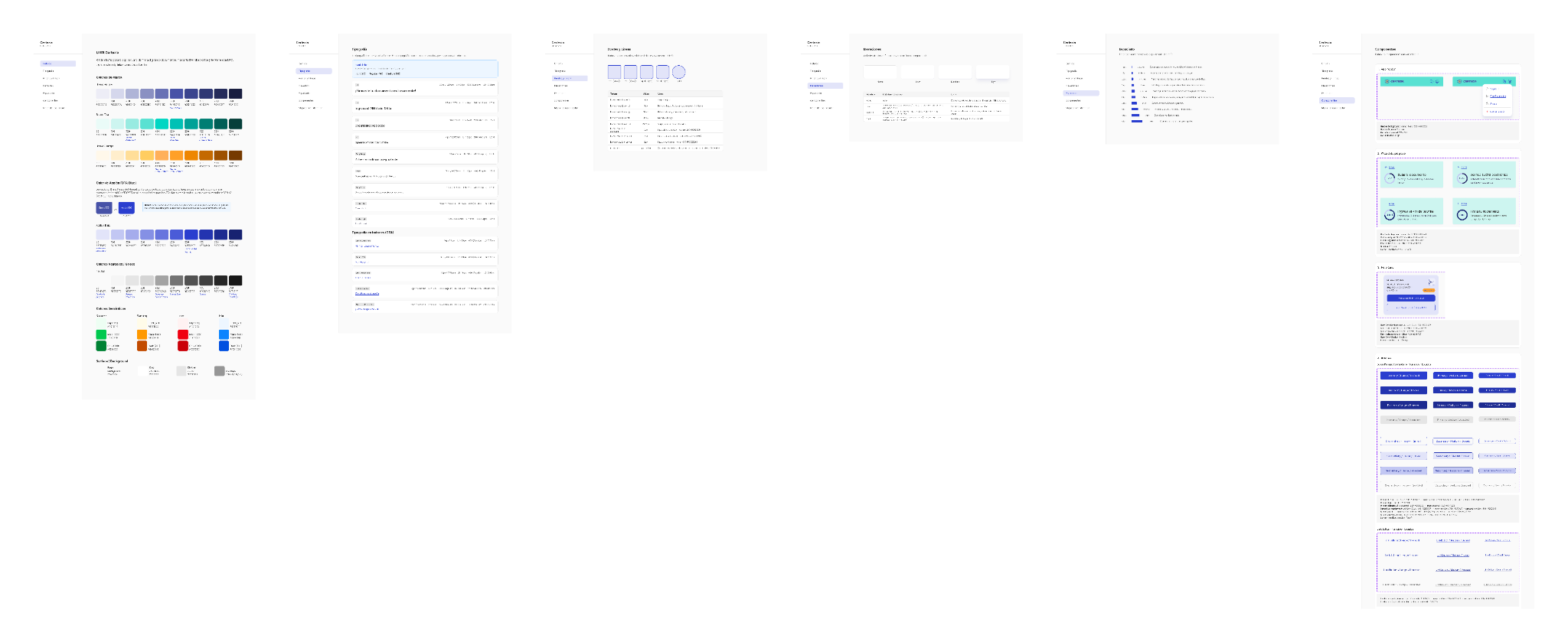
Certezia UI Kit: colors, typography, components and states.
12
Learnings
- UX does not stop at the screen.
When an experience involves NFC, documents or hardware, you also need to design around what people are physically doing while they use the product. - Errors are part of the main journey.
In critical processes, designing recovery is as important as designing the happy path. - Design and technology needed to move together.
Understanding the SDK before finalizing interactions prevented me from designing behaviors that could not be implemented. - Observation revealed more than questions alone.
Watching how someone moved their phone, held the DNIe or reacted during a waiting state exposed issues that were not visible only through what they said.
Next case