MINSA PERU · GOVTECH
From a physical vaccination card to a digital experience for more than 10 million people
During the pandemic, I worked on the redesign of Peru’s Ministry of Health Vaccination Record, a service millions of citizens relied on to access and verify their COVID-19 vaccination information.
The challenge was not simply to digitize a document. I needed to turn it into a clear and accessible public service that could work for people with very different levels of access to technology.
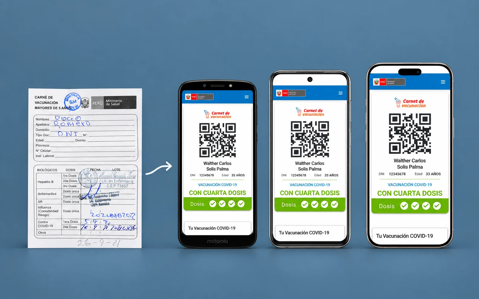
From a physical vaccination card to a digital experience for more than 10 million people
The challenge was not only to simplify a service used by millions of people. I also had to design for a very diverse technological reality, where not every citizen had access to a recent smartphone or a large screen.
10M+people used the platform
Mobile firstdesigned from the most constrained devices up
Accessibilitydesigned to include a wider range of citizens
Design Systema consistent foundation for the product to grow
01
Context
During the pandemic, the Vaccination Record became an everyday service for millions of people in Peru. It allowed citizens to check their registered doses and show proof of vaccination when required.
The product had grown quickly in response to an exceptional situation. As it expanded, issues also emerged around navigation, information hierarchy and consistency across screens.
There was another, less visible challenge: designing a public digital experience for citizens with very different access to technology. Someone using a recent smartphone needed to access the same service as someone using a low-end device with a much smaller screen.
My job was to revisit that experience and build a clearer, more accessible foundation that could continue to grow.
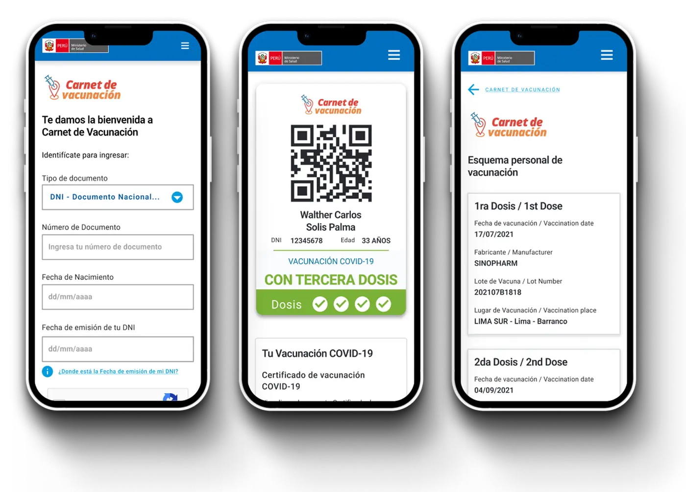
MINSA digital Vaccination Record.
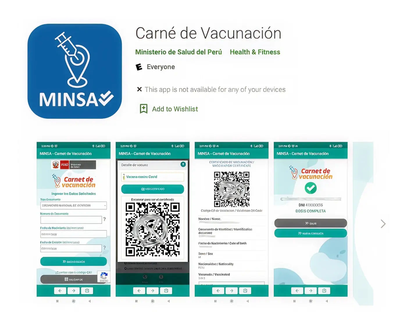
Original MINSA app on the Play Store.
02
The problem
For most people, opening the Vaccination Record served a very specific purpose: finding their information and being able to show it quickly. The interface, however, had accumulated content and navigation that made those tasks less straightforward than they needed to be.
- Important information was difficult to prioritize
Essential information and secondary content competed for attention on the same screen. - Some journeys could be shorter
Certain tasks required more navigation than necessary to reach the information people were looking for. - Inconsistent visual hierarchy
Actions, messages and content did not always make it clear what the user should do first. - A wide range of devices
The service needed to work for citizens using different operating systems, screen sizes and levels of hardware performance. - An interface that needed to scale
As new requirements were added, I needed to avoid solving the same interaction problems differently on every screen.
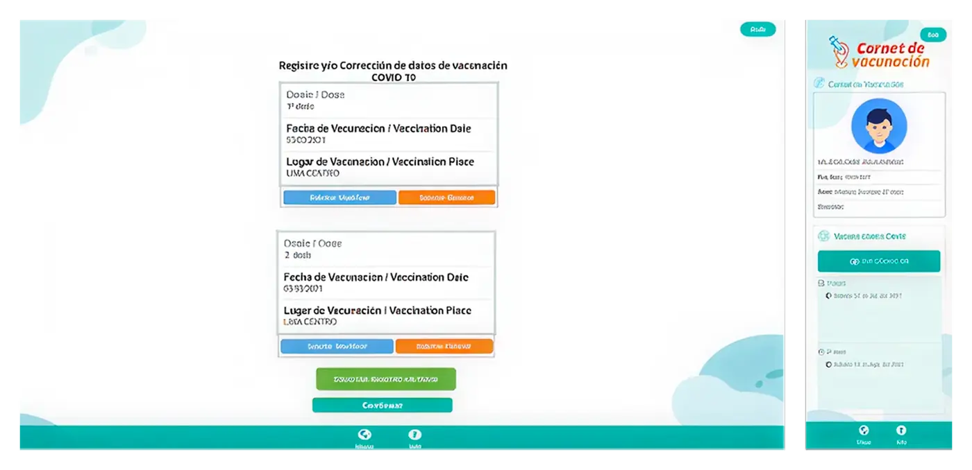
Original interface with hierarchy and consistency problems.
03
Discovery and user needs
Before designing the new screens, I researched which smartphones, operating systems and screen sizes were most commonly used in Peru at the time.
That research changed an important design decision: instead of starting from the ideal device, I chose to design from more constrained scenarios. If this service was going to become part of the country’s digital public infrastructure, it also needed to work for citizens using low-end smartphones.
At the same time, I reviewed the information architecture, key journeys and areas where the experience could be simplified. This allowed me to separate navigation, content, hierarchy and responsive issues before moving into UI design.
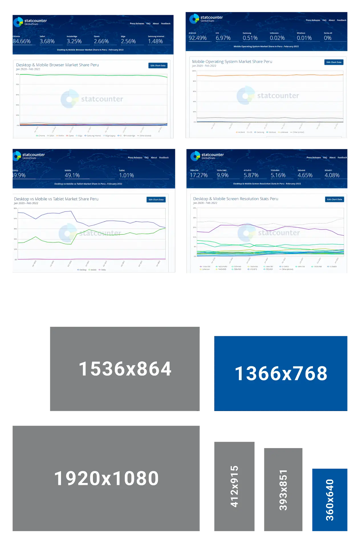
Most-used devices and resolutions in Peru.
04
UX process
I started with structure and user journeys. Before deciding what the interface should look like, I needed to understand what information belonged on each screen, how it should be prioritized and how people would move between the main tasks.
Interface decisions were evaluated against the most constrained conditions I had identified: smaller screens, older devices and an experience that still needed to be understandable without relying on high-end hardware.
From there, I translated those decisions into flows and interface proposals that I could review with the team before moving into visual detail.
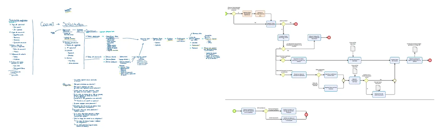
Information architecture exploration
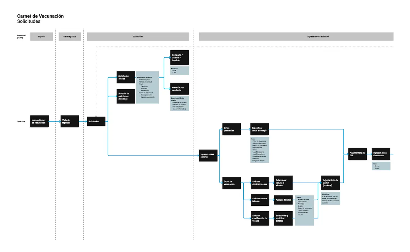
Defining key user journeys
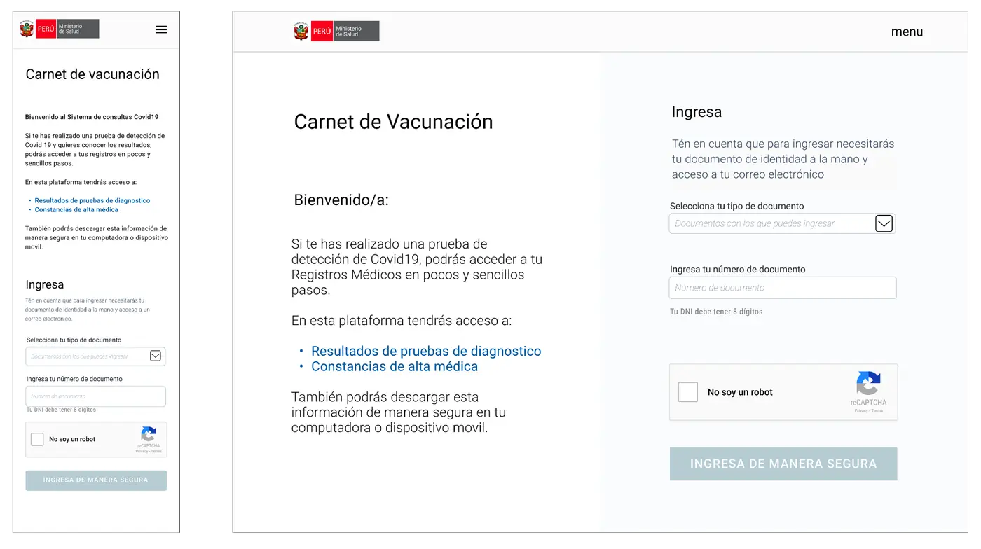
Early navigation proposals
05
Design goals
01Make what matters obvious
Give greater hierarchy to the tasks and information people needed to access first.
02Remove unnecessary steps
Simplify journeys so frequent tasks could be completed with less navigation.
03Design from the most constrained scenarios
Start with low-end smartphones and smaller screens instead of assuming every citizen had access to a recent device.
04Create a consistent interface
Define reusable components and patterns so new functionality could be added without redesigning every screen from scratch.
06
Design System
The redesign could not be solved one screen at a time. I needed a shared foundation that would keep the experience consistent as the product continued to grow.
I worked on defining reusable components, variants and usage rules that could be applied across the experience and make collaboration between design and development easier.
The system also needed to preserve that consistency across different screen sizes instead of depending on a single type of device.
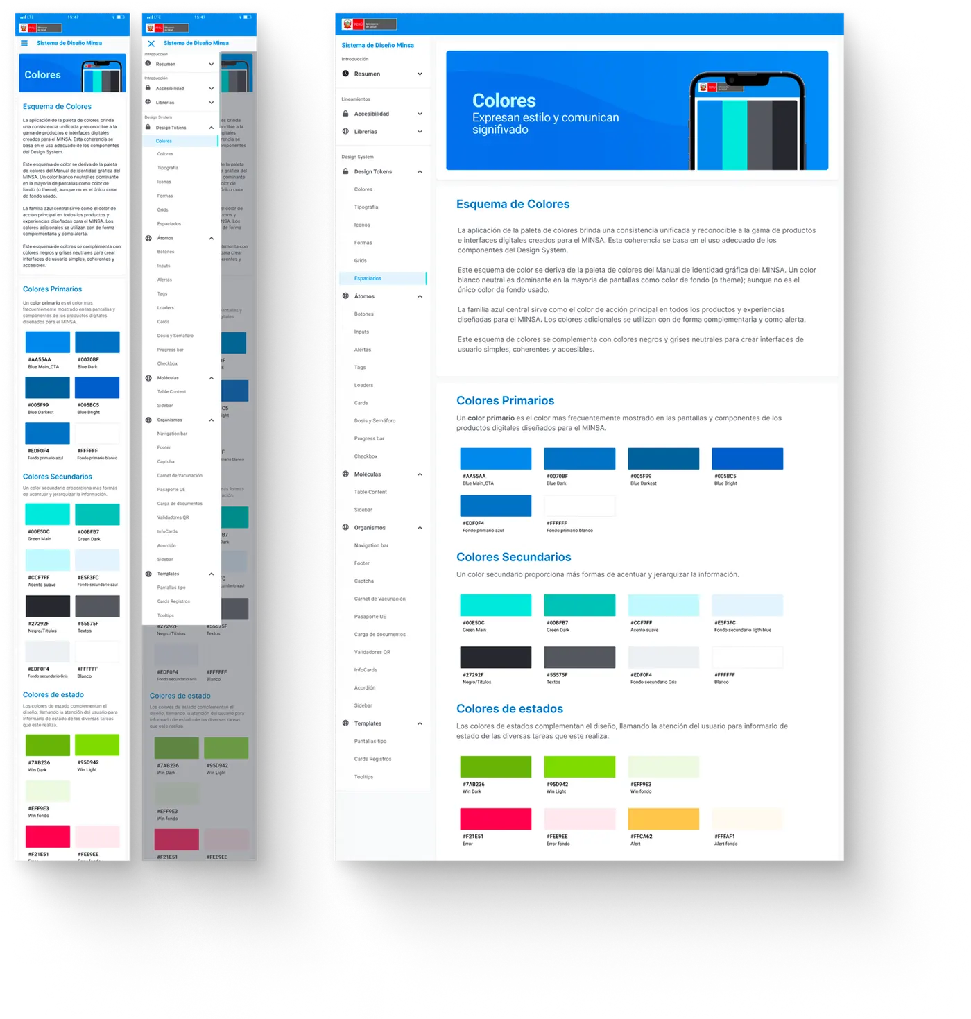
MINSA system tokens and guidelines.
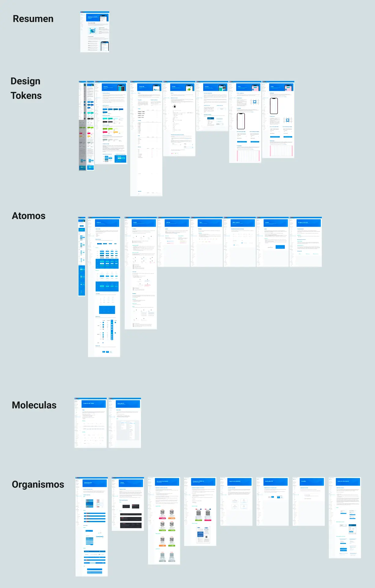
System components and organisms.
07
Accessibility and mobile first
Mobile first was a consequence of the context, not a design preference.
Before designing the interfaces, I researched the smartphones, operating systems and screen sizes that were most common in Peru. The conclusion was clear: designing only around recent smartphones could exclude some of the citizens who needed to use the service.
That is why I chose to start with smaller screens and low-end devices. Essential information still needed to be readable, primary actions needed to remain clear and key journeys had to work without assuming recent hardware.
For me, this was also an accessibility decision: adopting a new government technology should not depend on the phone someone could afford.
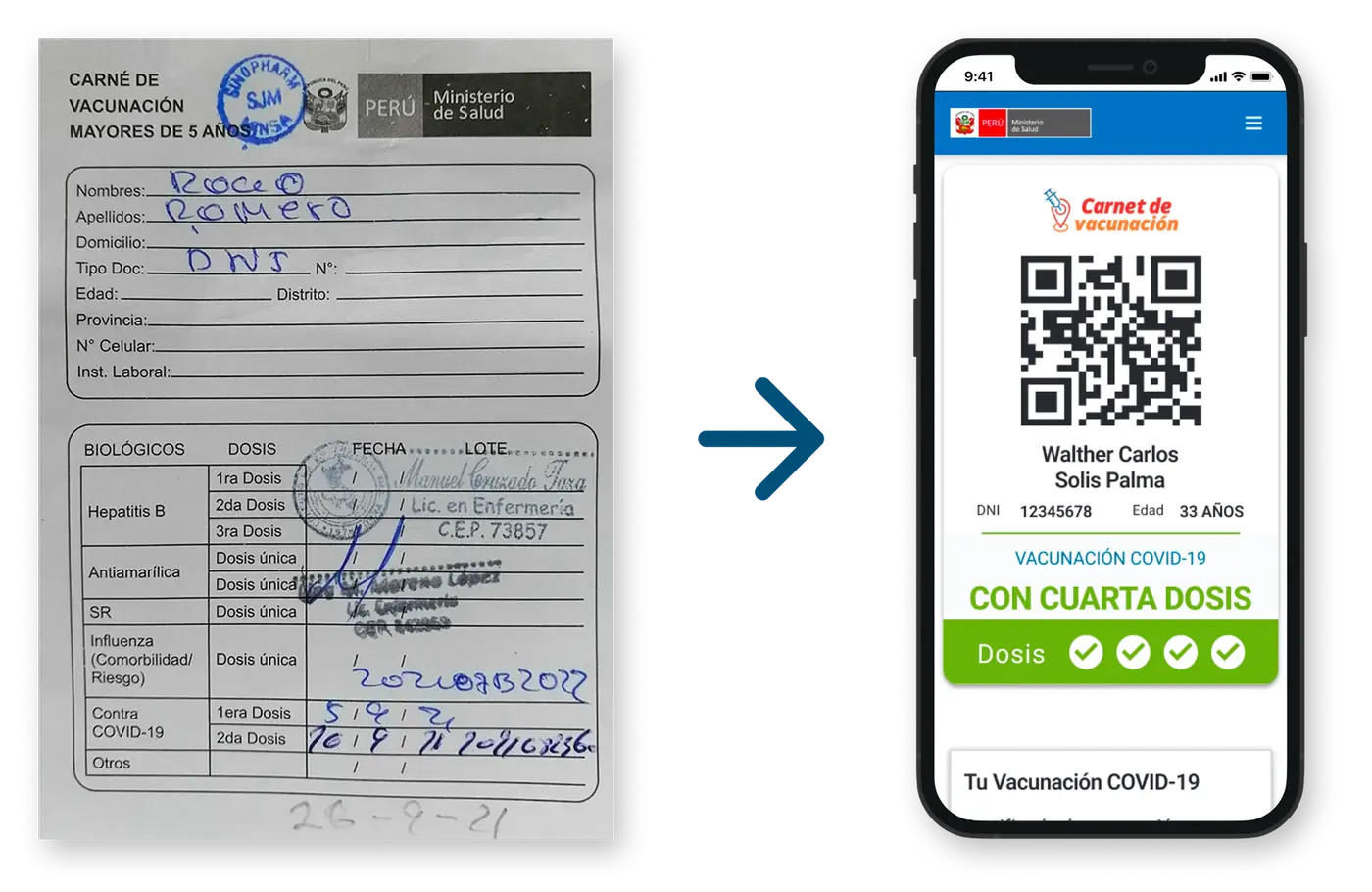
From the paper card to the digital card.
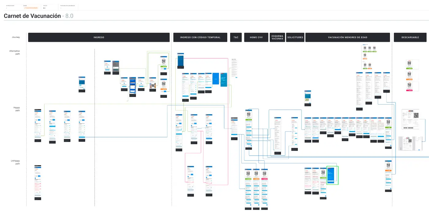
Final vaccination card flow.
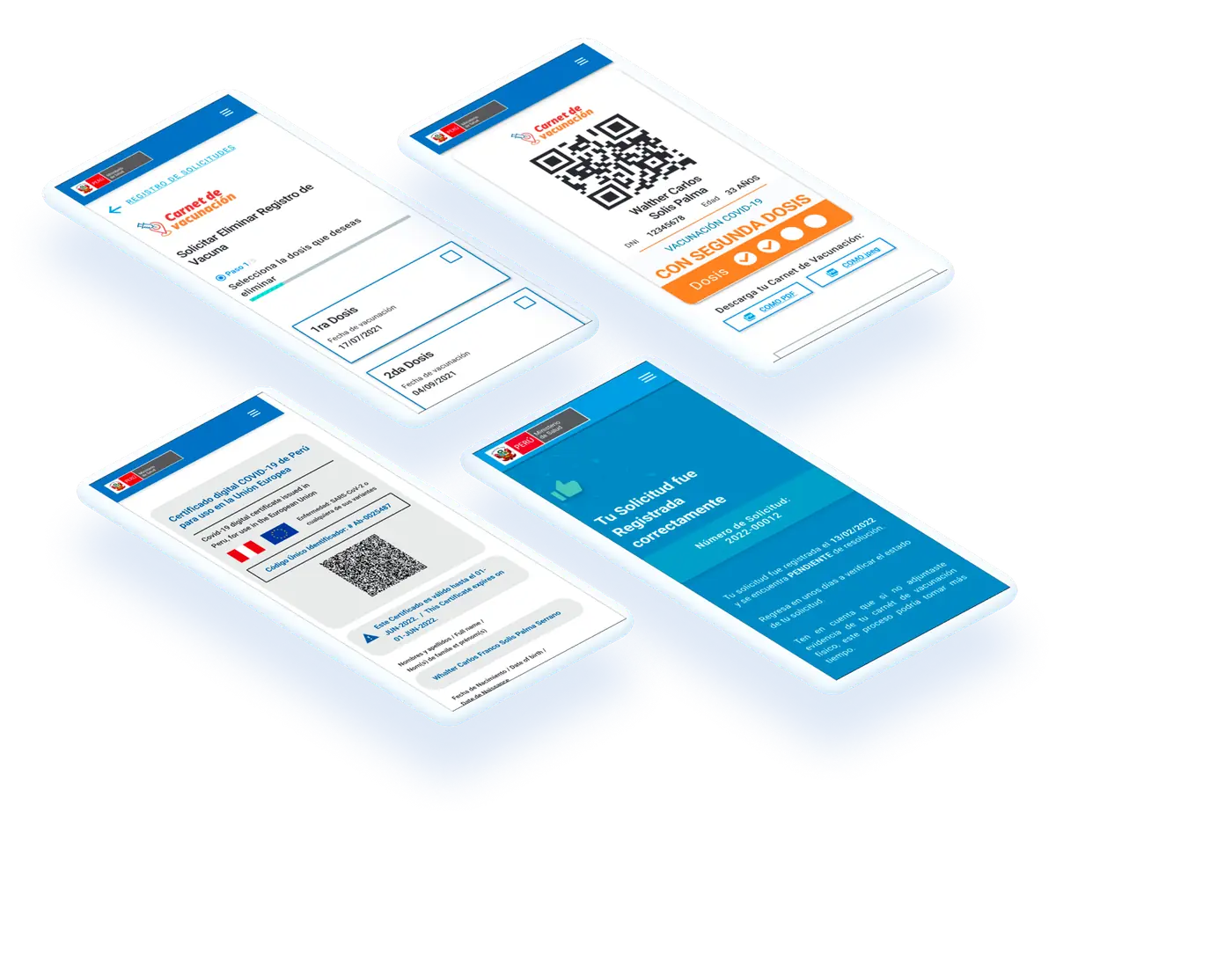
Final mockups.
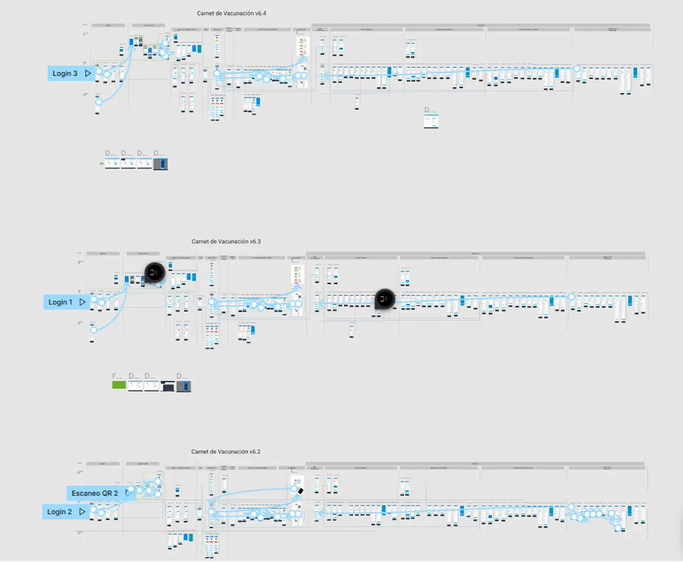
Clickable Figma prototypes, iterative versions.
08
Outcome
The redesign created a clearer and more consistent experience for a platform used by more than 10 million people.
The new architecture, Design System and accessibility decisions created a foundation designed to work across a much wider range of devices and screen sizes.
Beyond modernizing the interface, the goal was to make sure the digitalization of the service could also reach citizens with less access to recent technology.
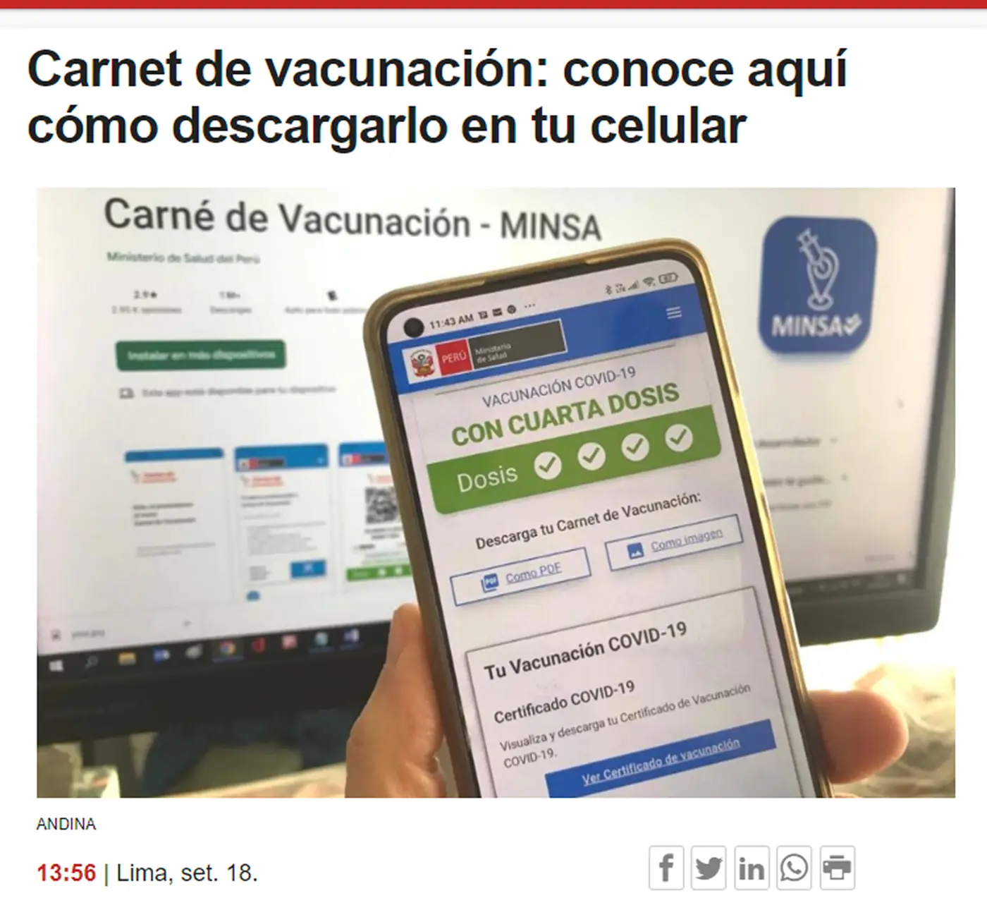
The product in real use, covered by the press.
09
Learnings
- Accessibility also means understanding the technological context.
It is not only about contrast, typography or button sizes. The device someone uses to access a service can also become a barrier. - Designing for millions means questioning your own frame of reference.
The phone used by a design team does not necessarily represent the devices used by most citizens. - Mobile first can be an inclusion decision.
Starting from more constrained conditions forced me to prioritize information more carefully and avoid making the experience dependent on recent devices. - A Design System can also help sustain accessibility.
Shared patterns help ensure that important decisions do not depend on how each individual screen is designed.
Next case